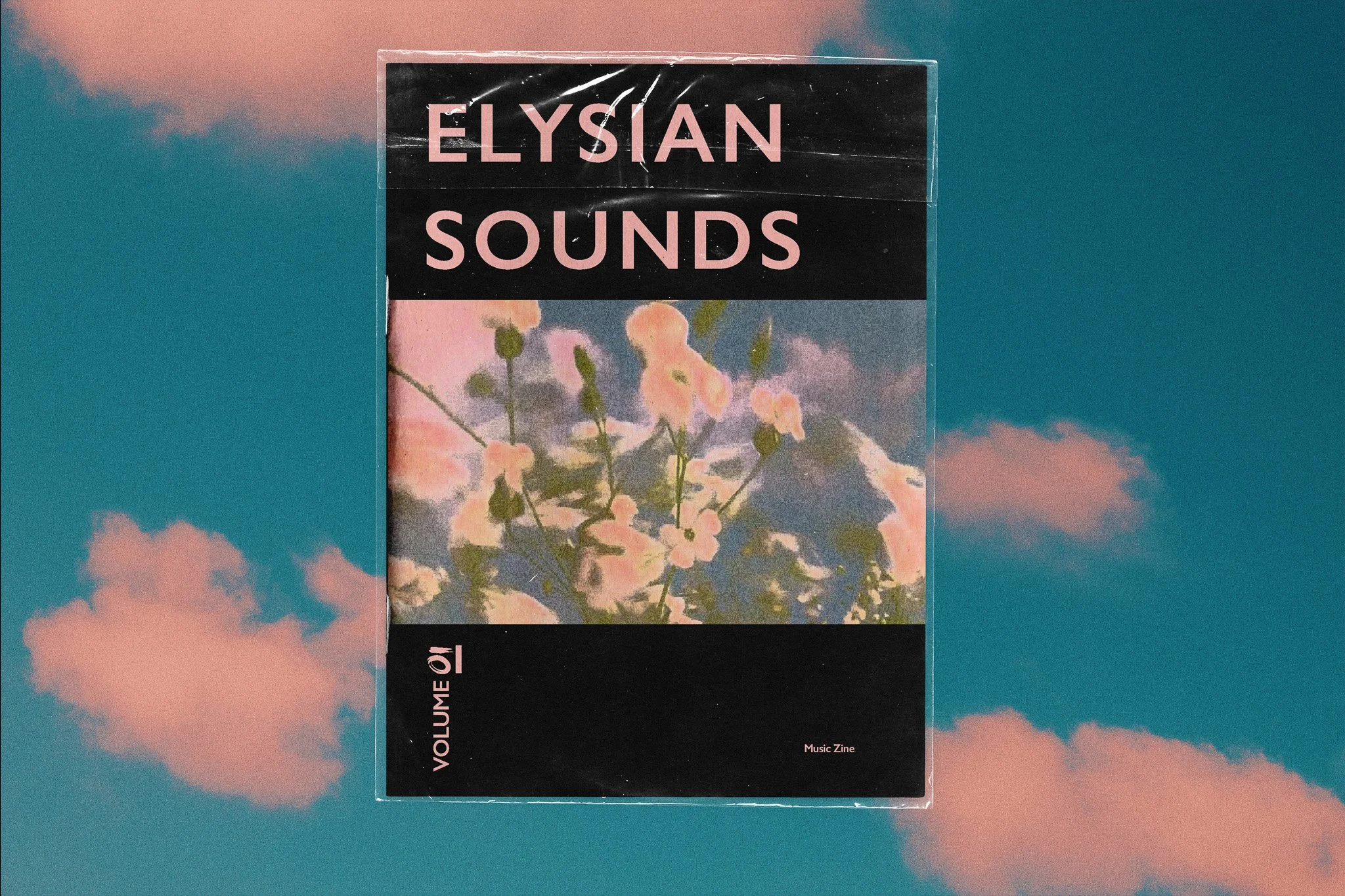
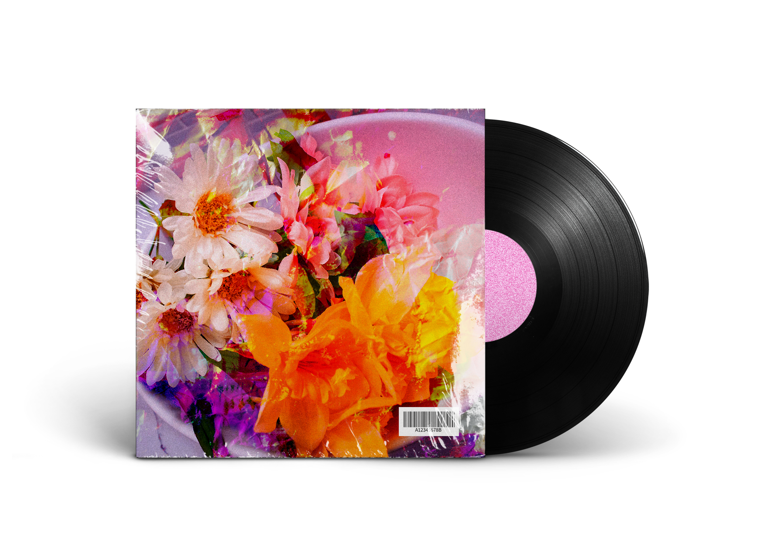
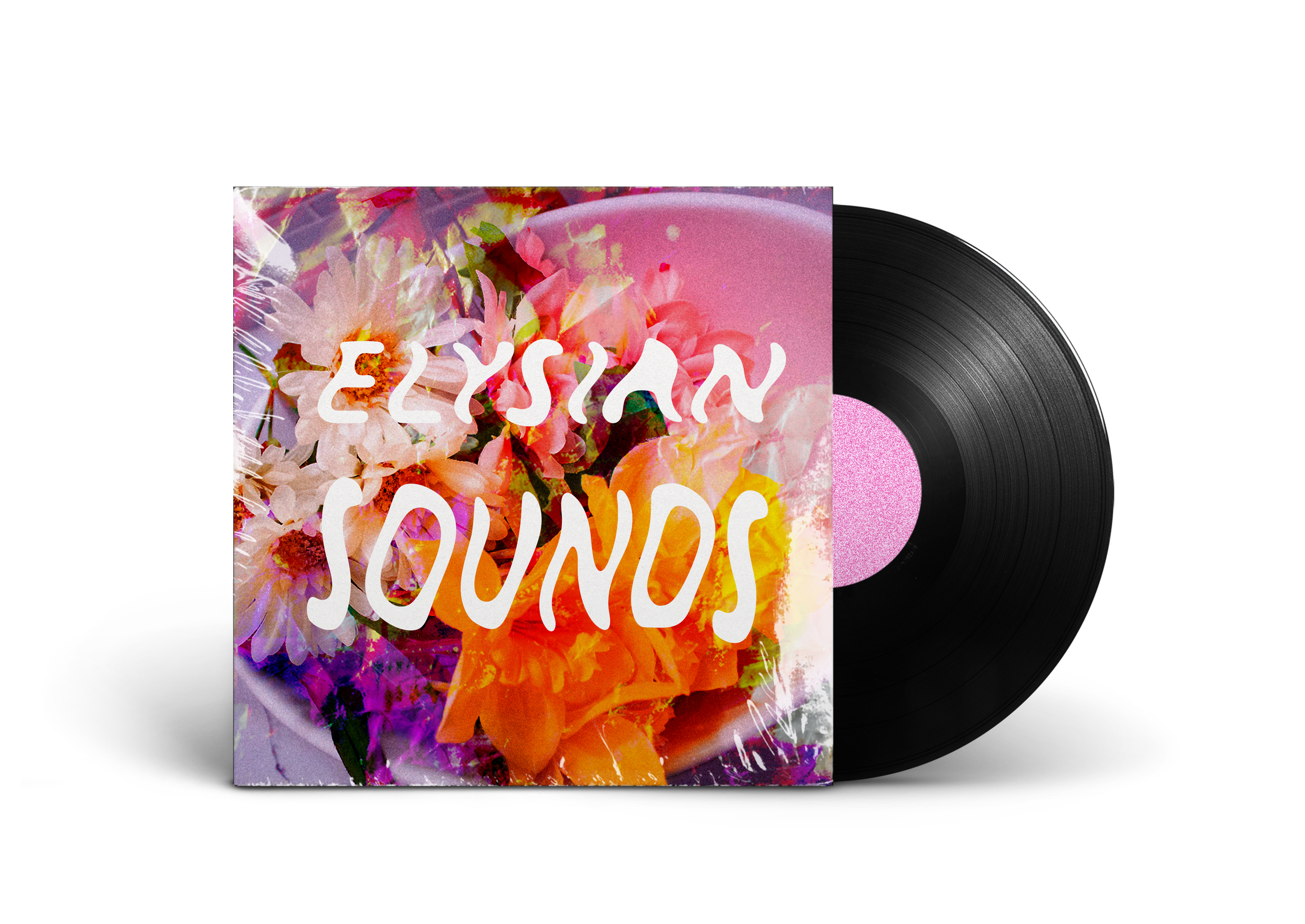
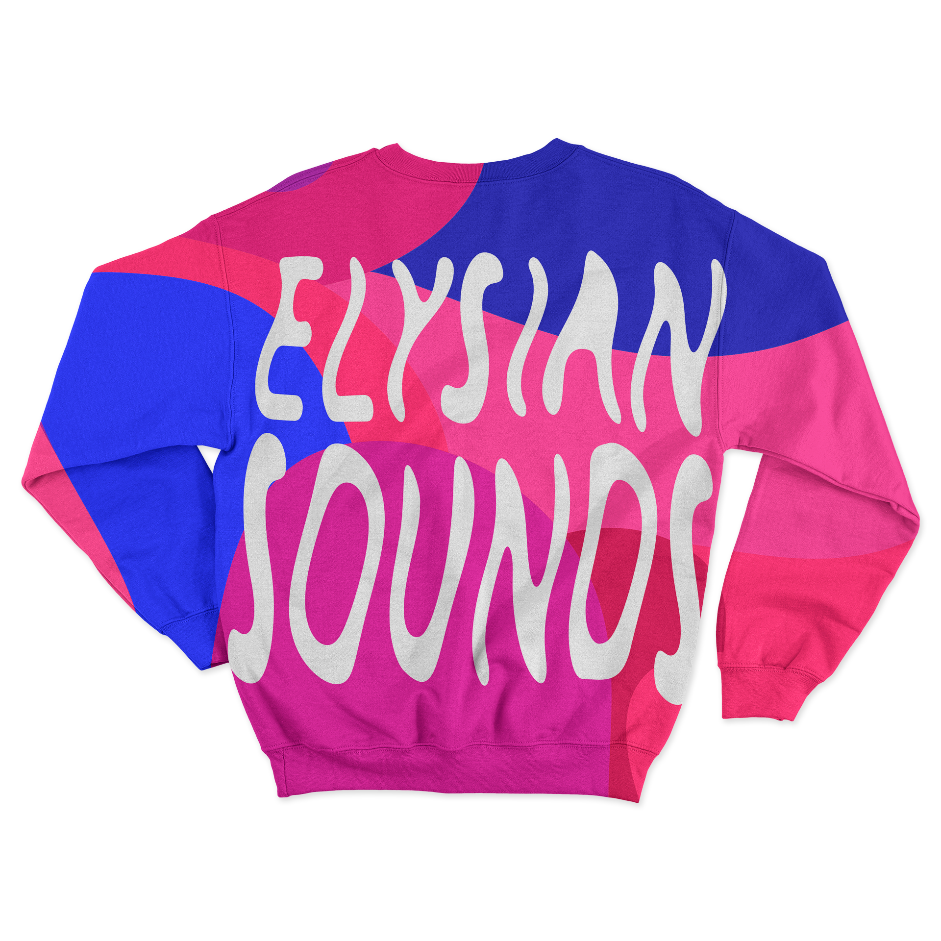
Zine
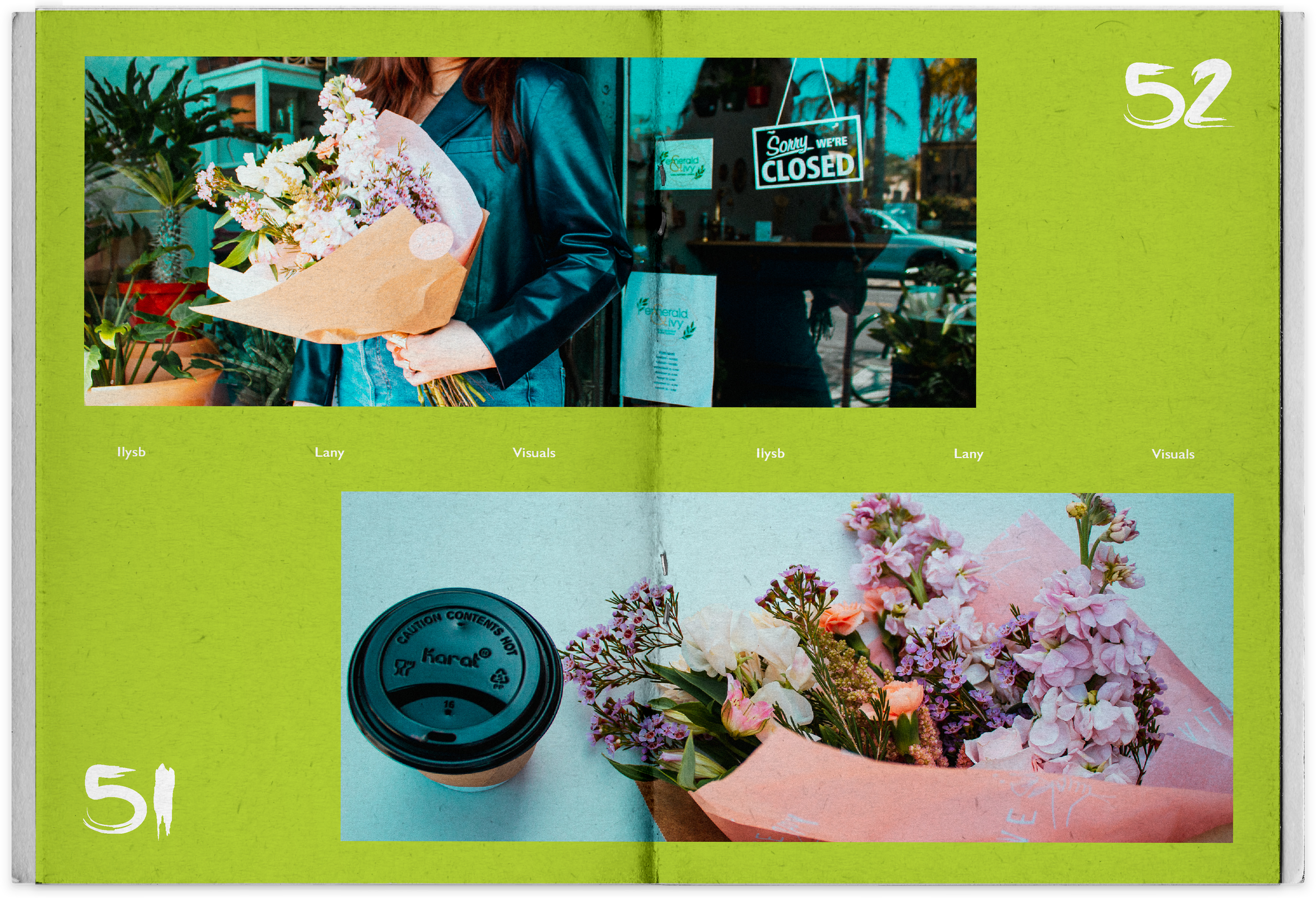
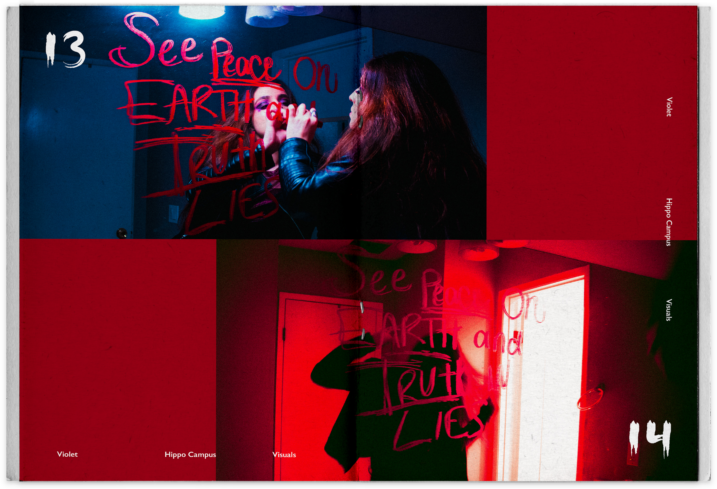
The zine was a passion project that expressed how music makes me feel. Enhancing art direction through communication, writing and photography skills. Having myself be one of the subjects in the project was an important element, for the viewer to feel a greater connection with me and on what I am passionate about.
A representation on where I want my career to lead towards to.
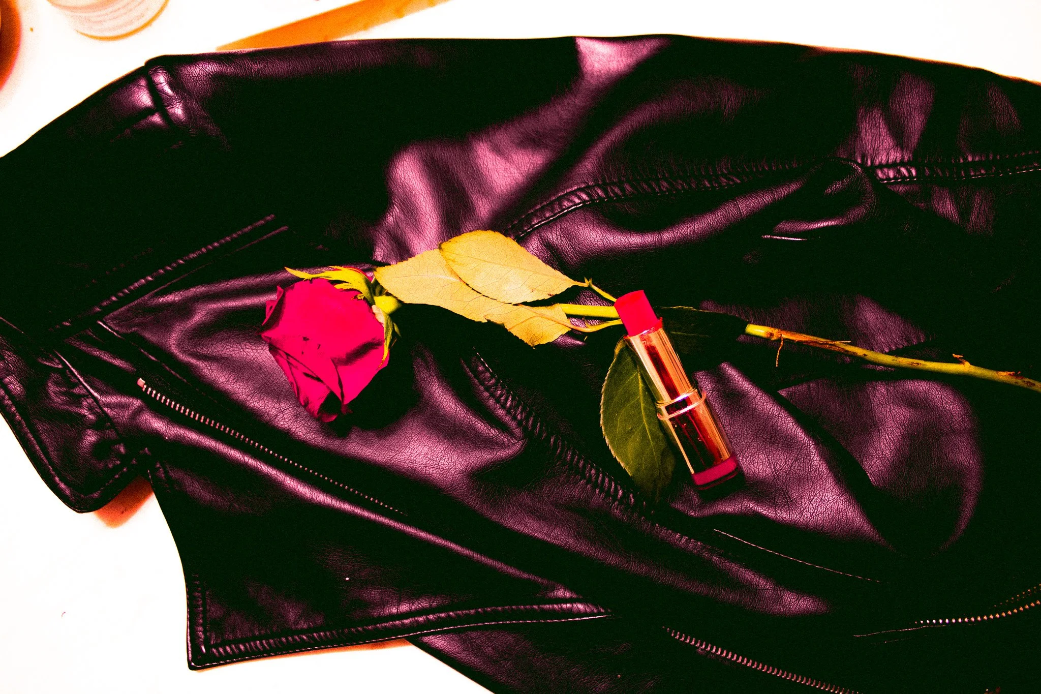
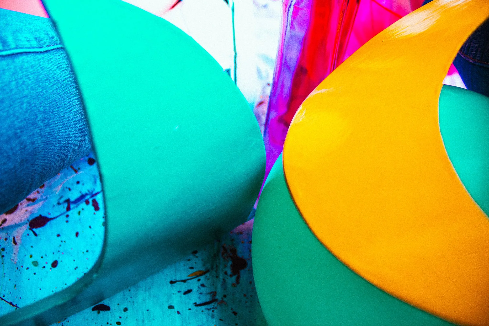
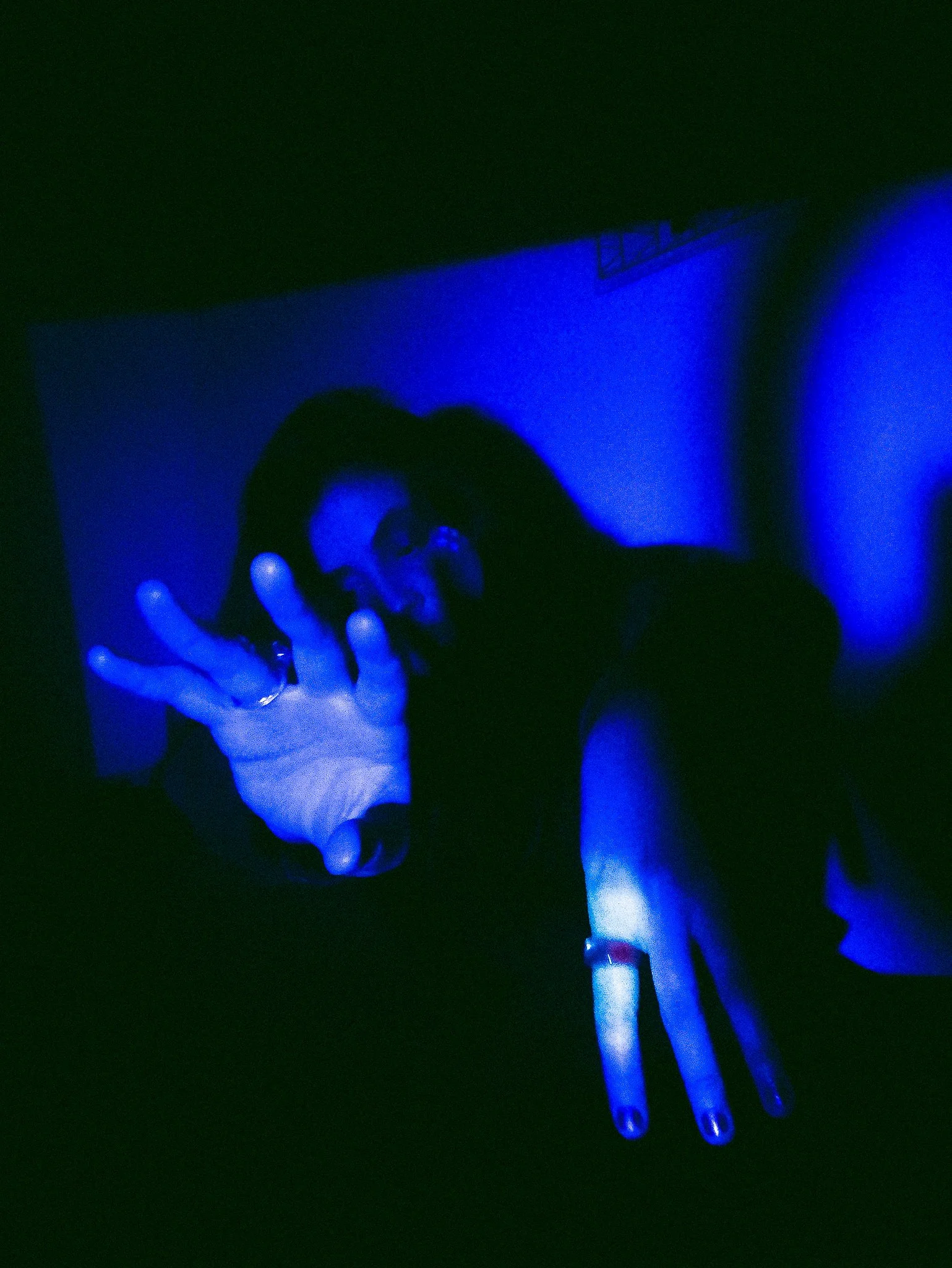
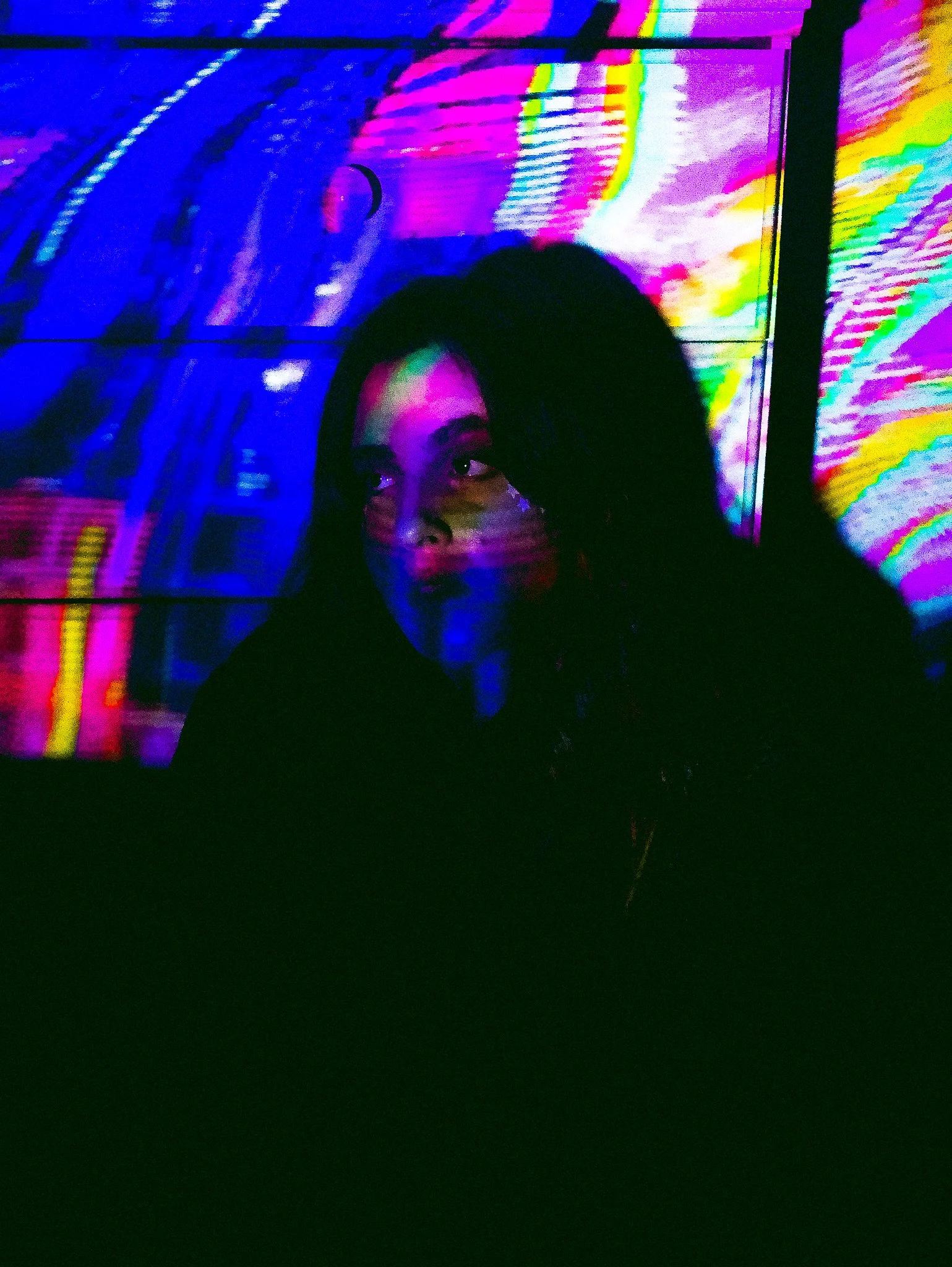
As a designer showcasing a part of who I am and giving a direction towards being part of the music and entertainment industry. Being experimental as i set a time, tone, color; scene, subjects and typography. Discovering the abilities my senses have, when listening to different sounds and genres of music.
Through these compositions of self expression, were a form of escaping the real world.
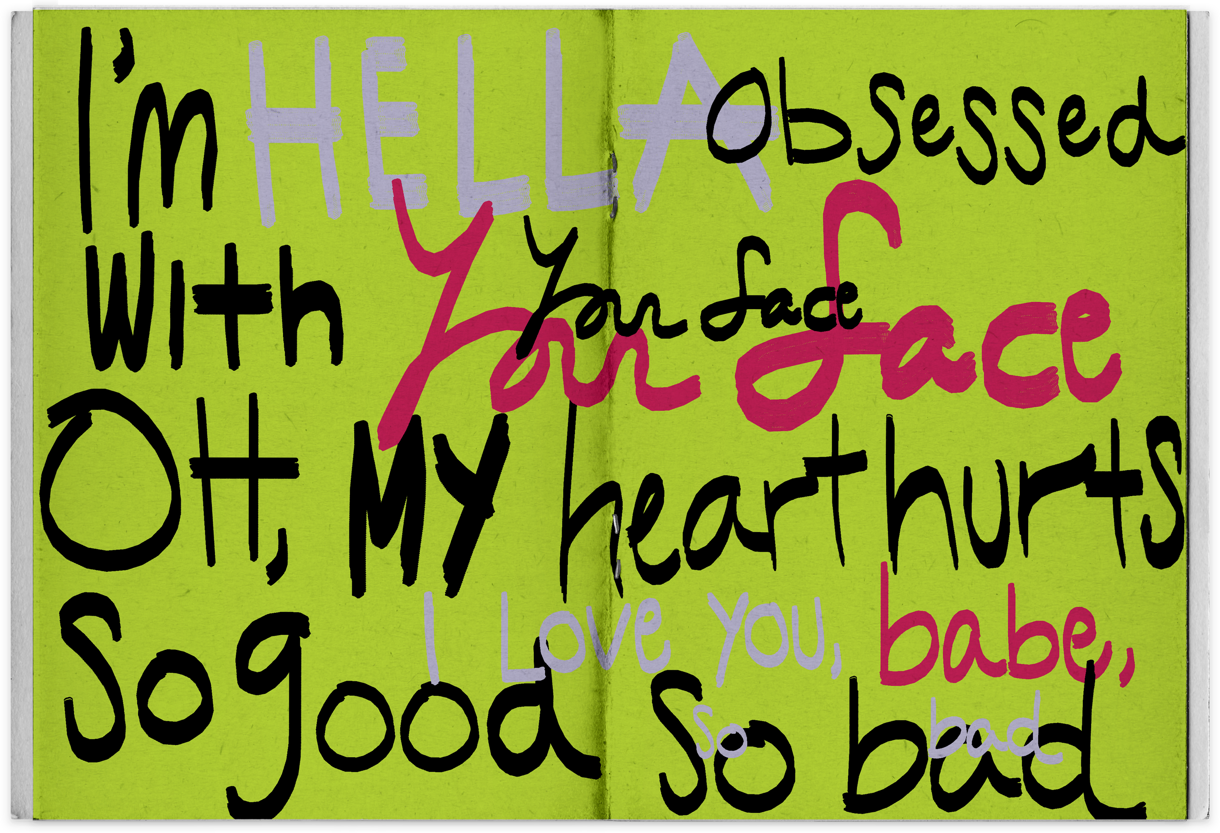
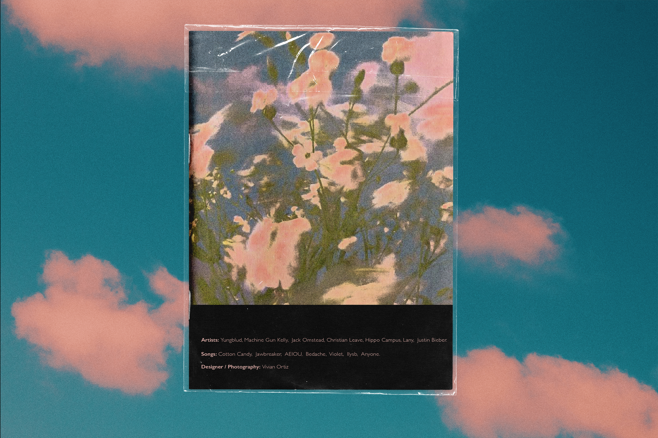
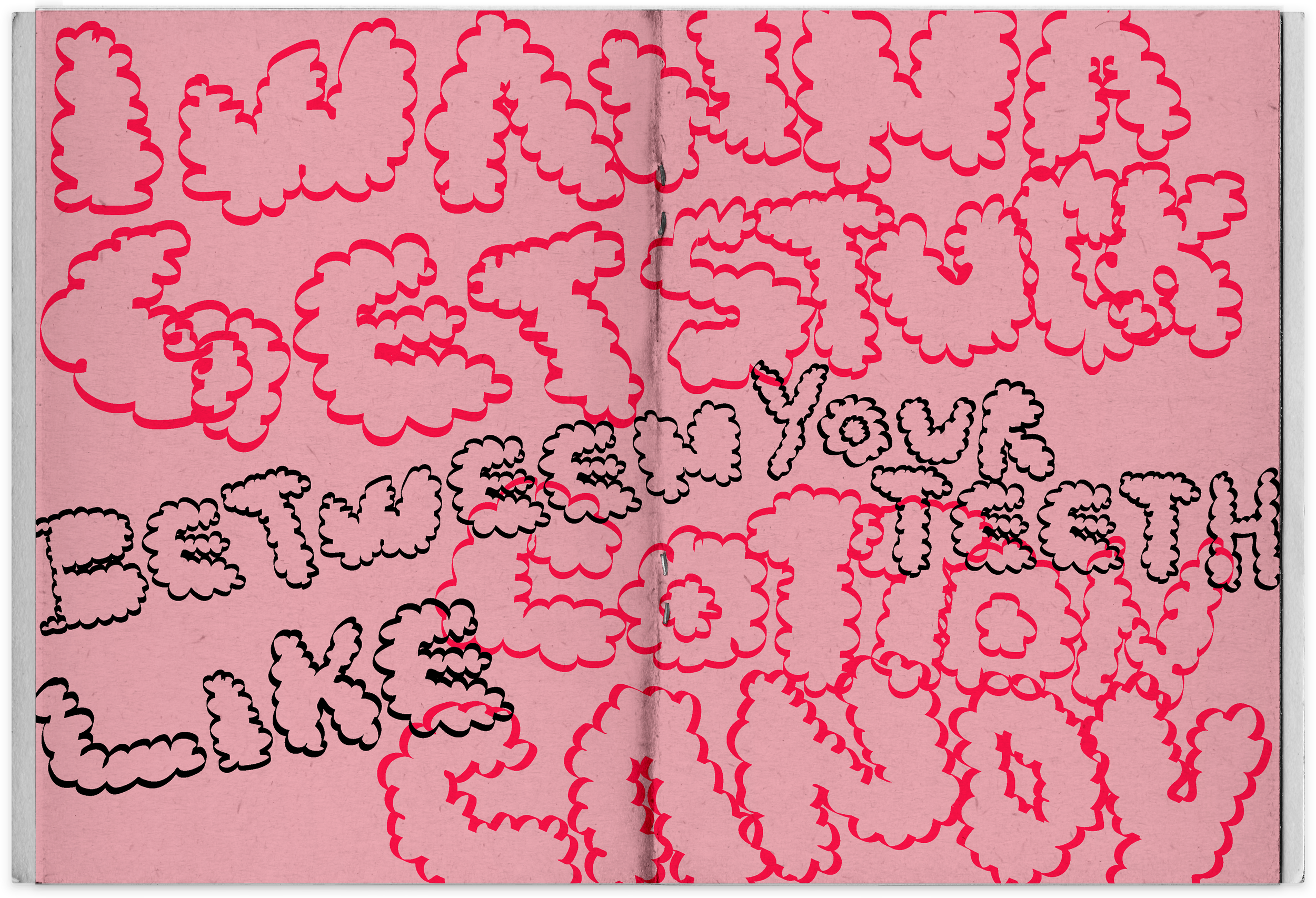
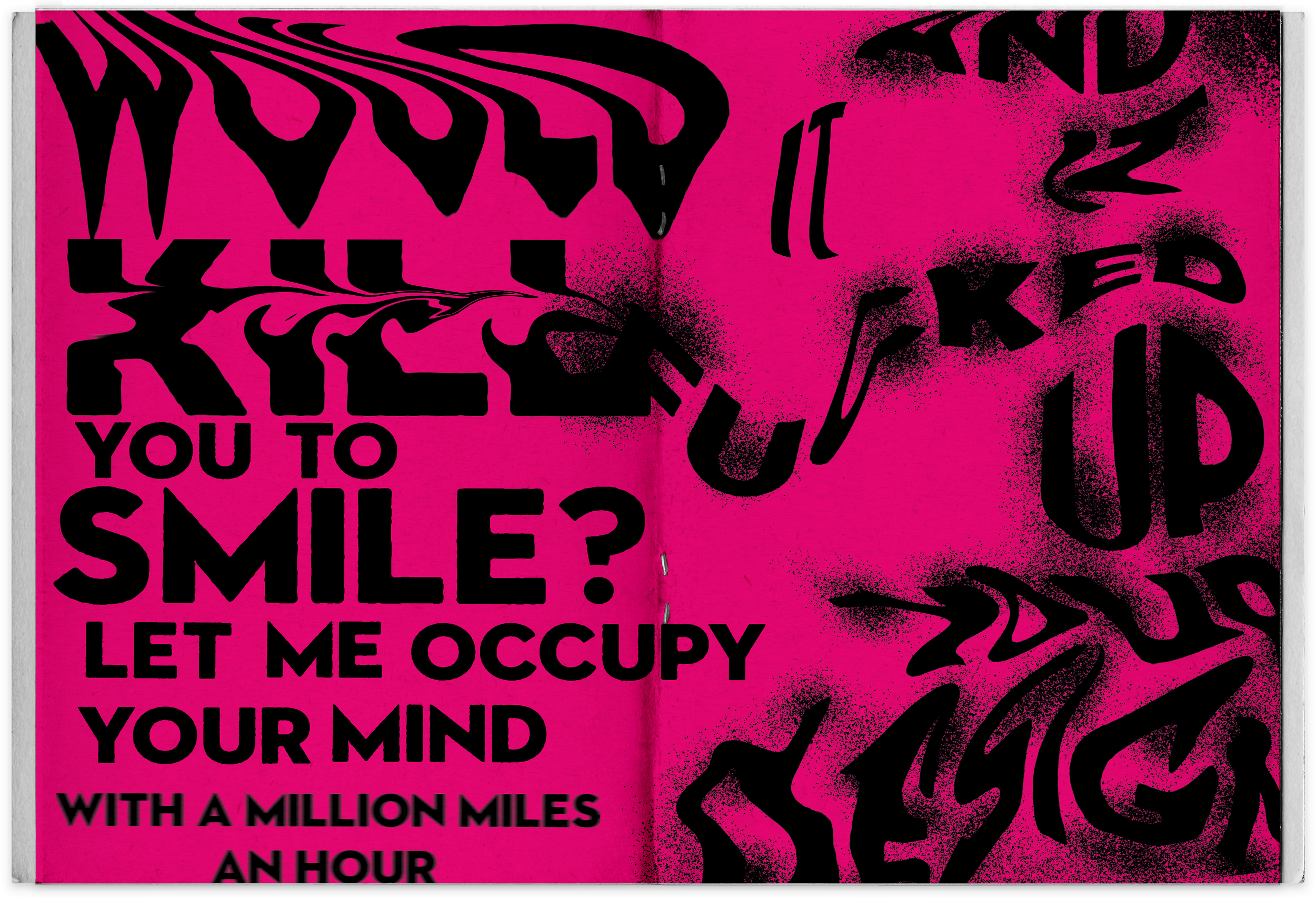
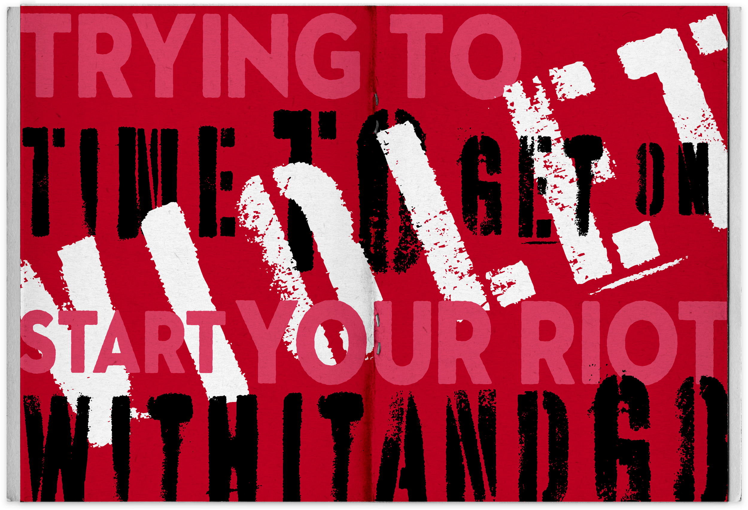
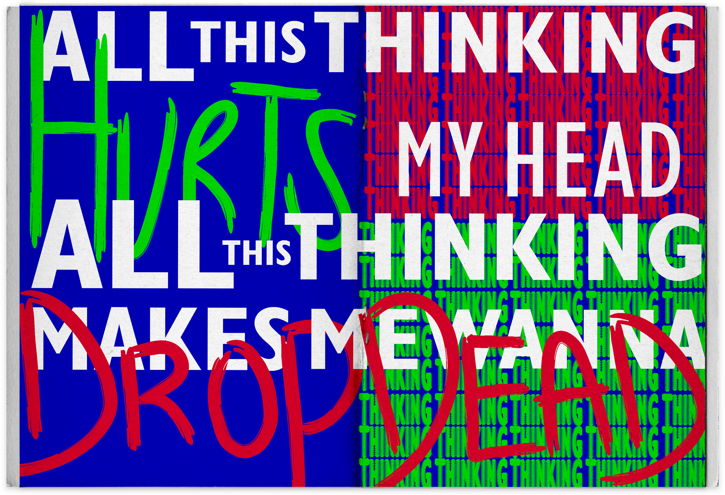
I wanted a name that reflected to that, which Elysian I found it to be the one that called to me, a word that means heaven or paradise. Throughout the layouts of lyrics there was a mix of handwritten and existing typography to represent my mind and what the songs made me feel.
SPRING 2021
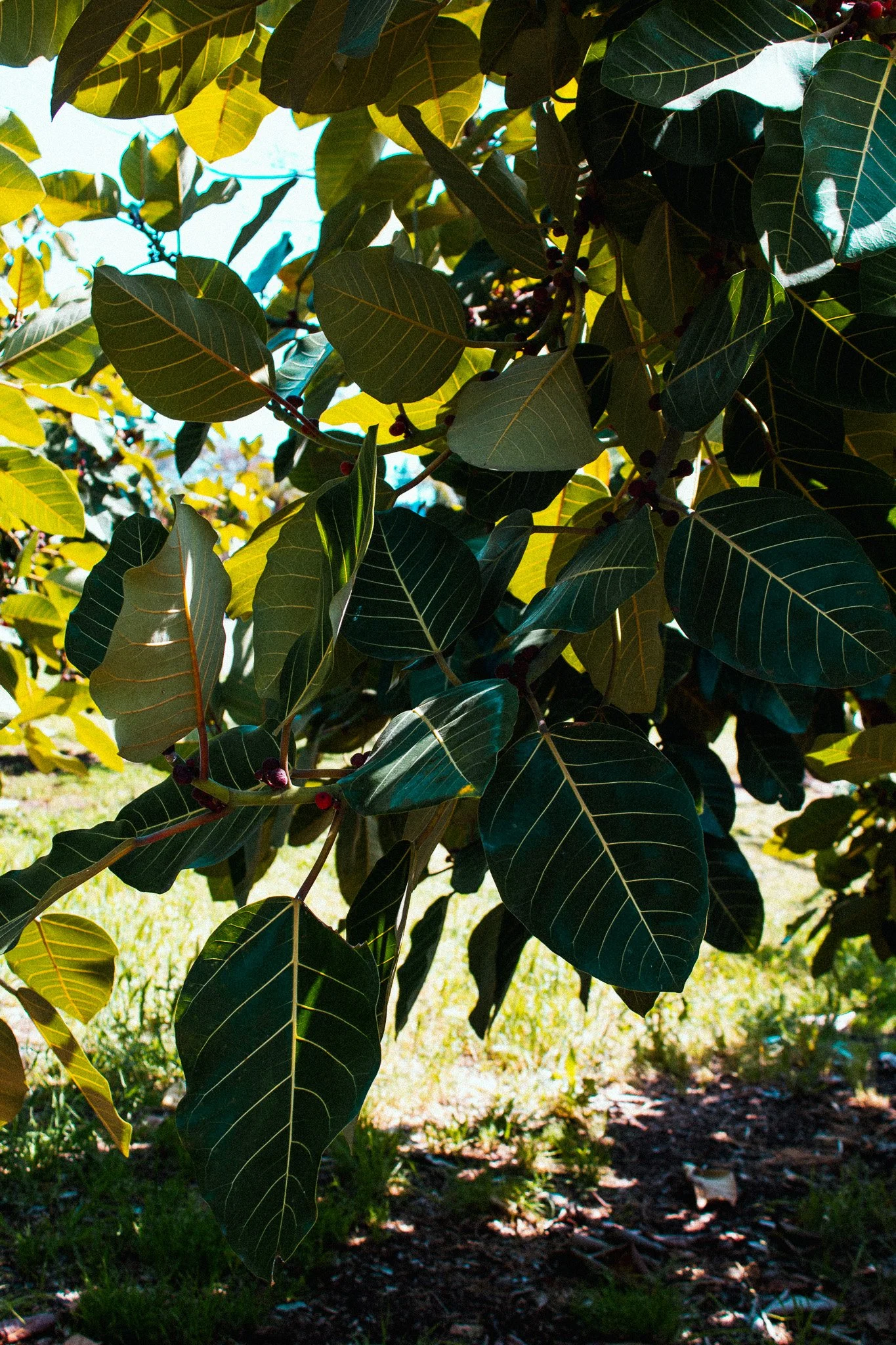
moodboard


Mrs Eaves, Typographica, Sonders Sans and Battery Park typefaces were used for displaying the pages containing lyrics. Gill Sans family styles, were used for text on front and back page of zine, small text in pages and listing of songs on contents page.

COTTON CANDY
Y u n g b l u d


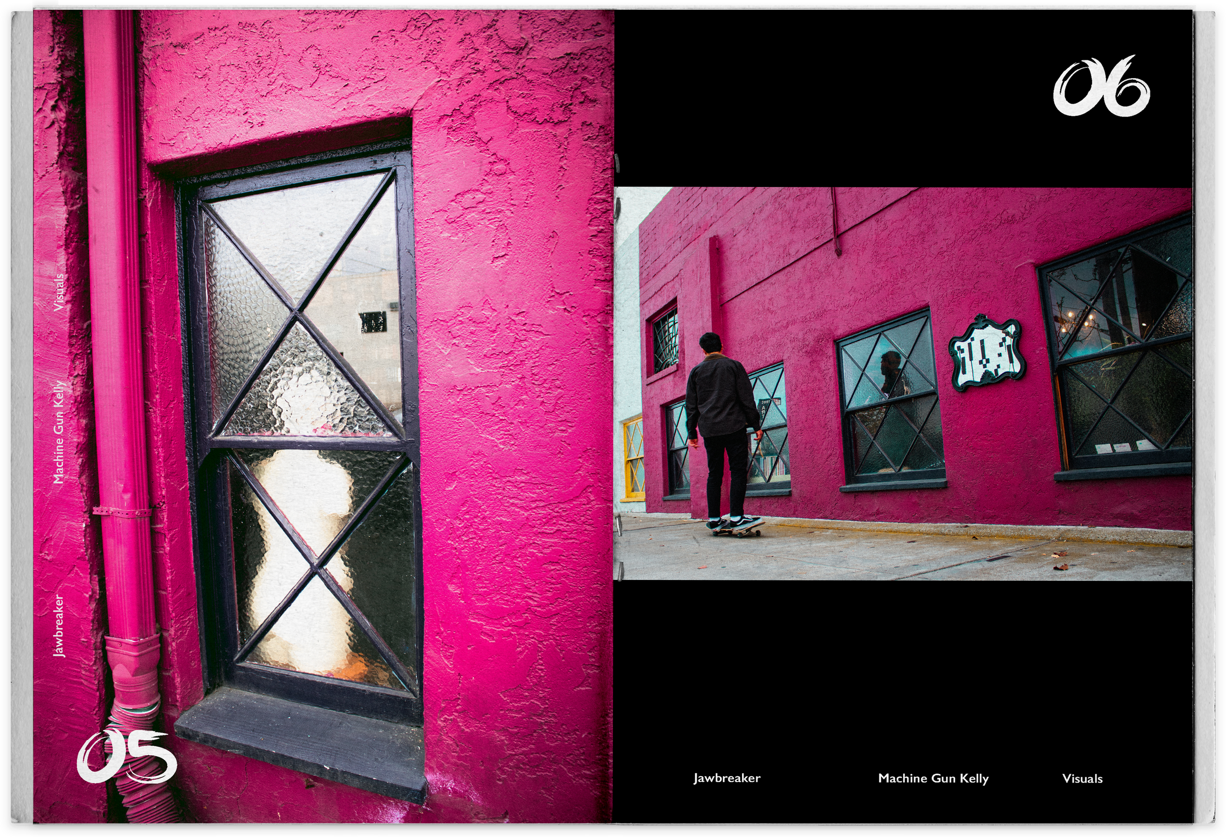
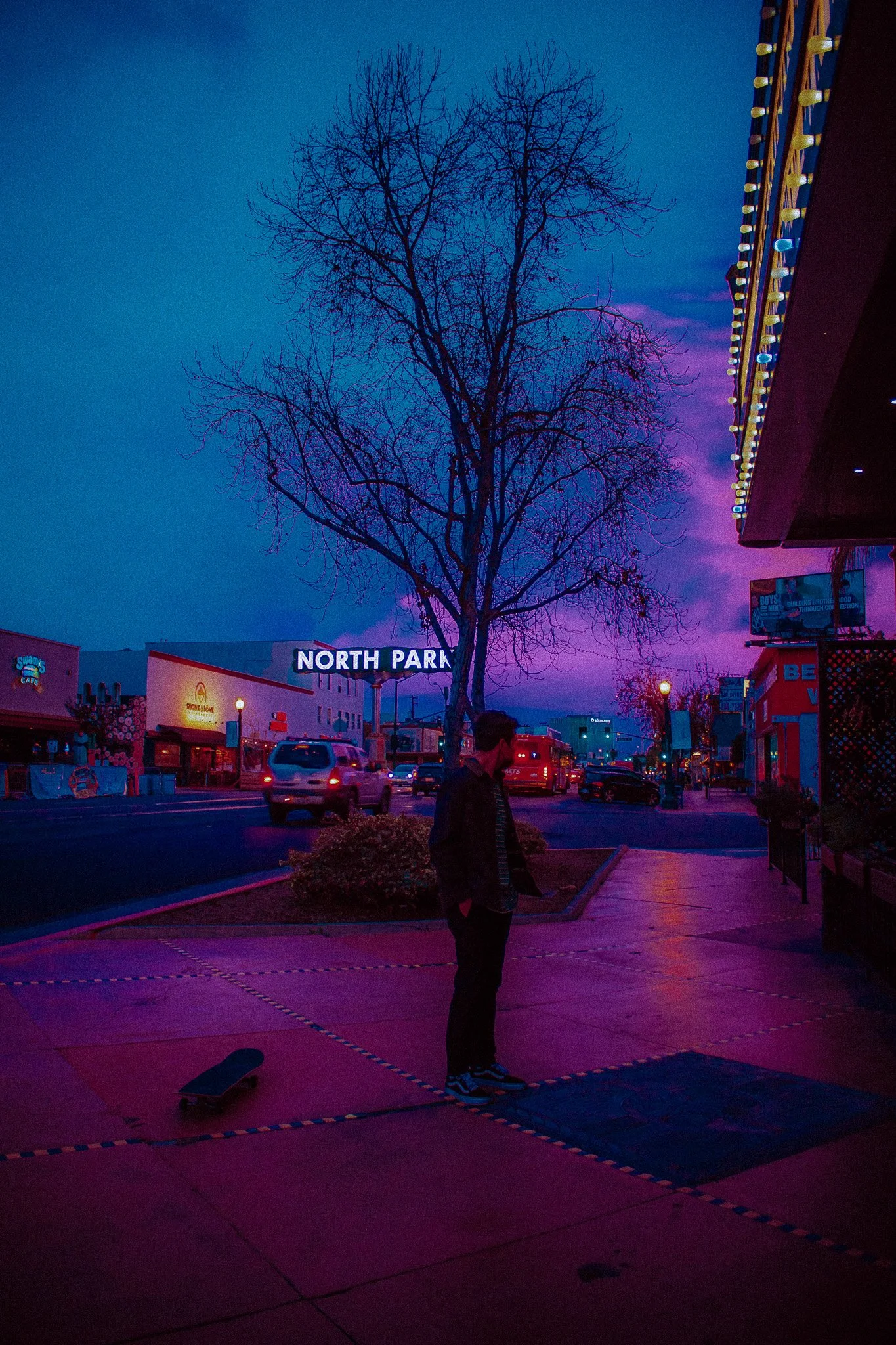
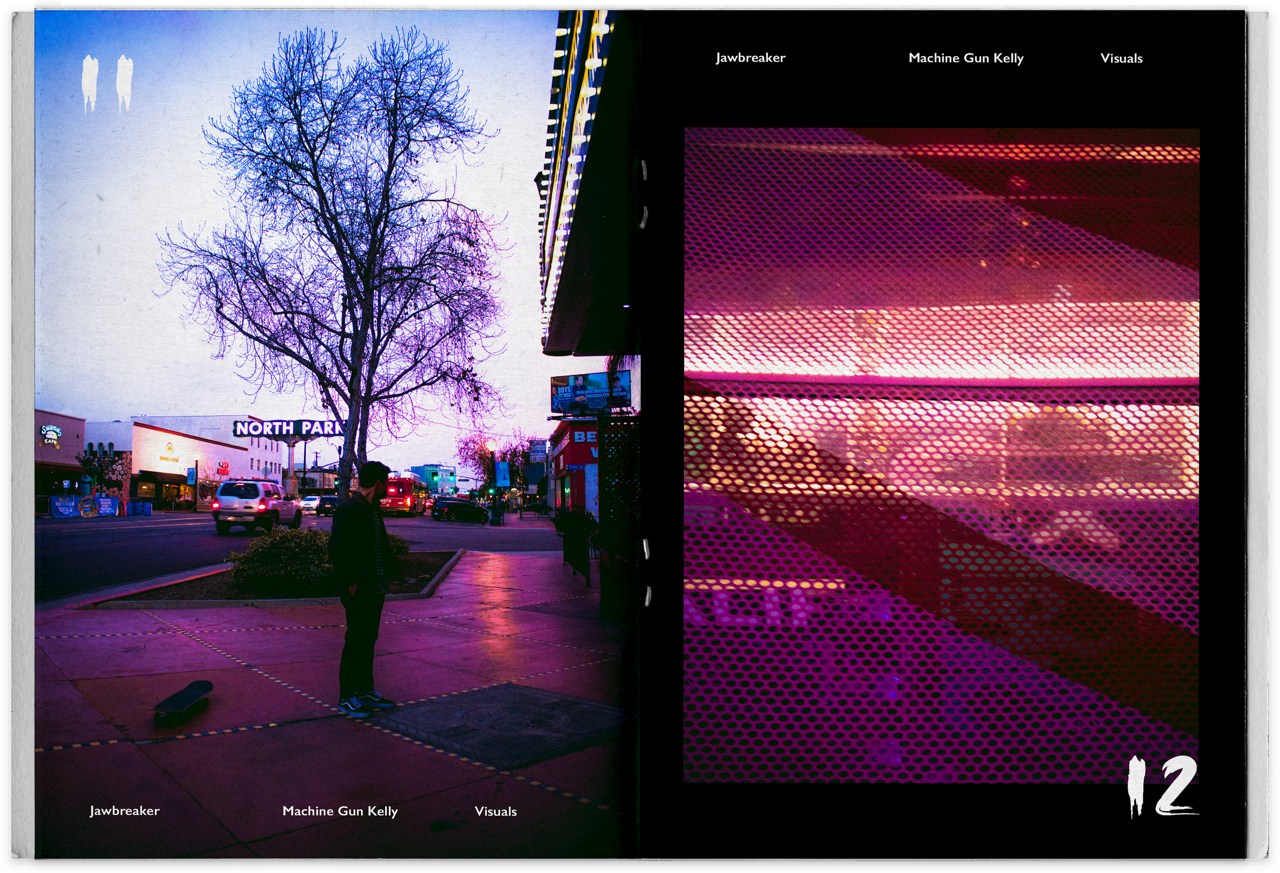
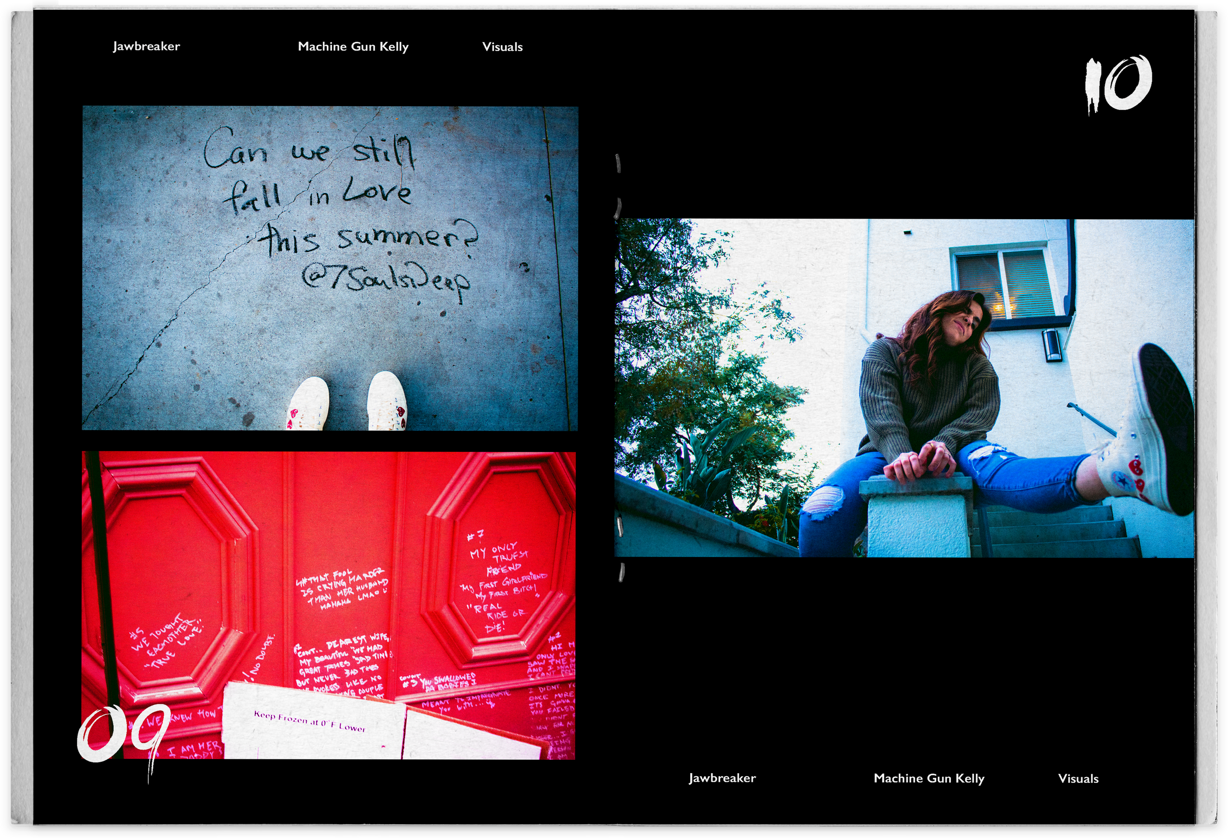
JAWBREAKER
M a c h i n e g u n k e l l y
Violet
H i p p o C a m p u s


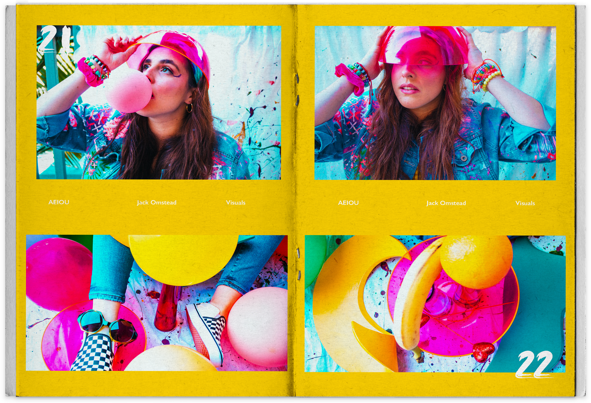
AEIOU
J a c k O m s t e a d


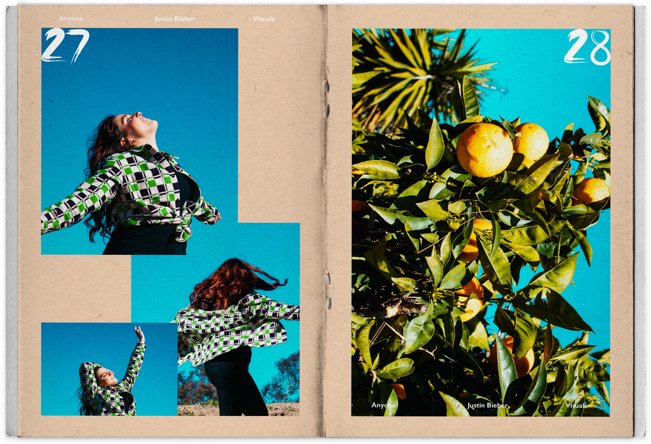
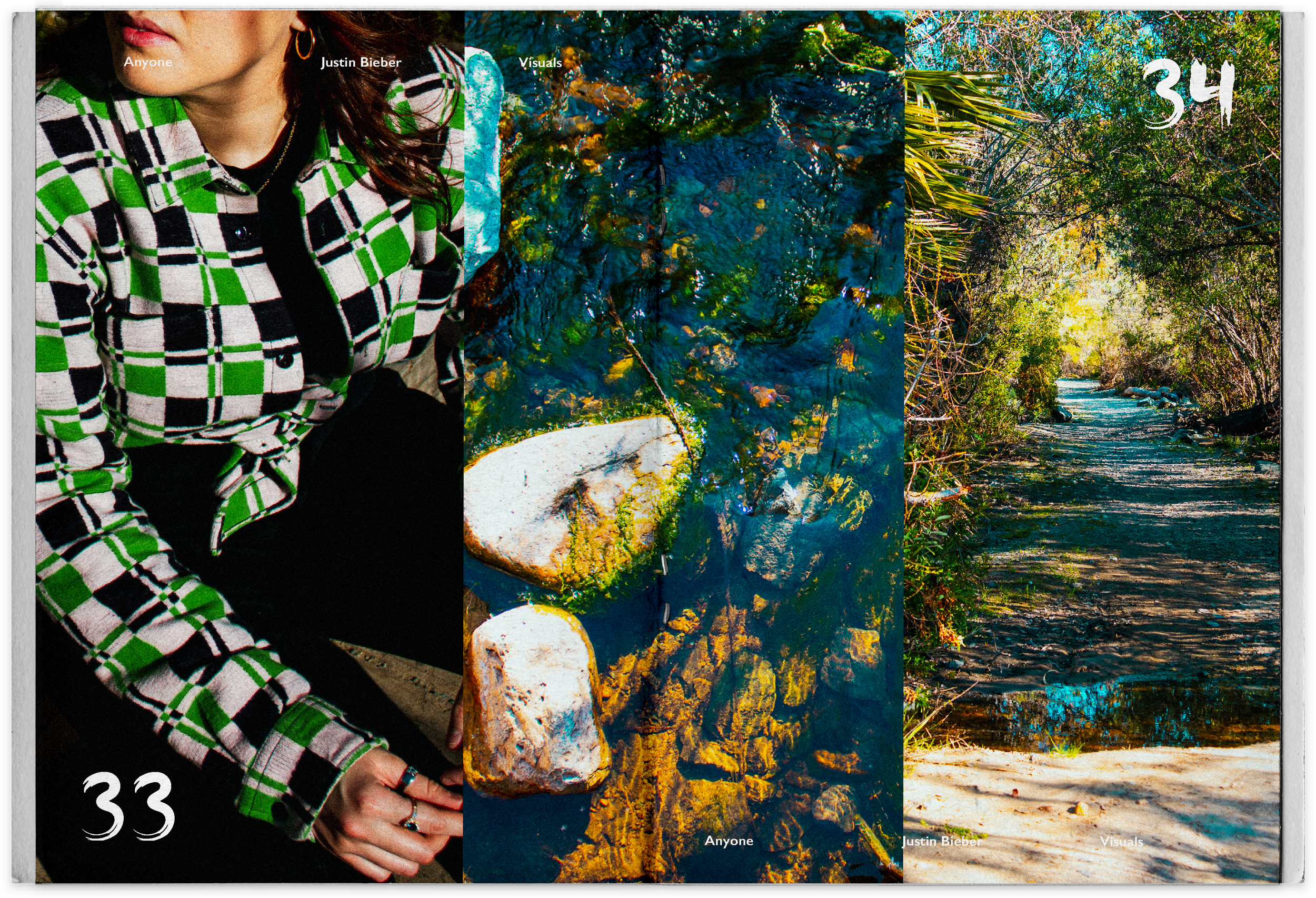
ANYONE
J u s t i n B i e b e r


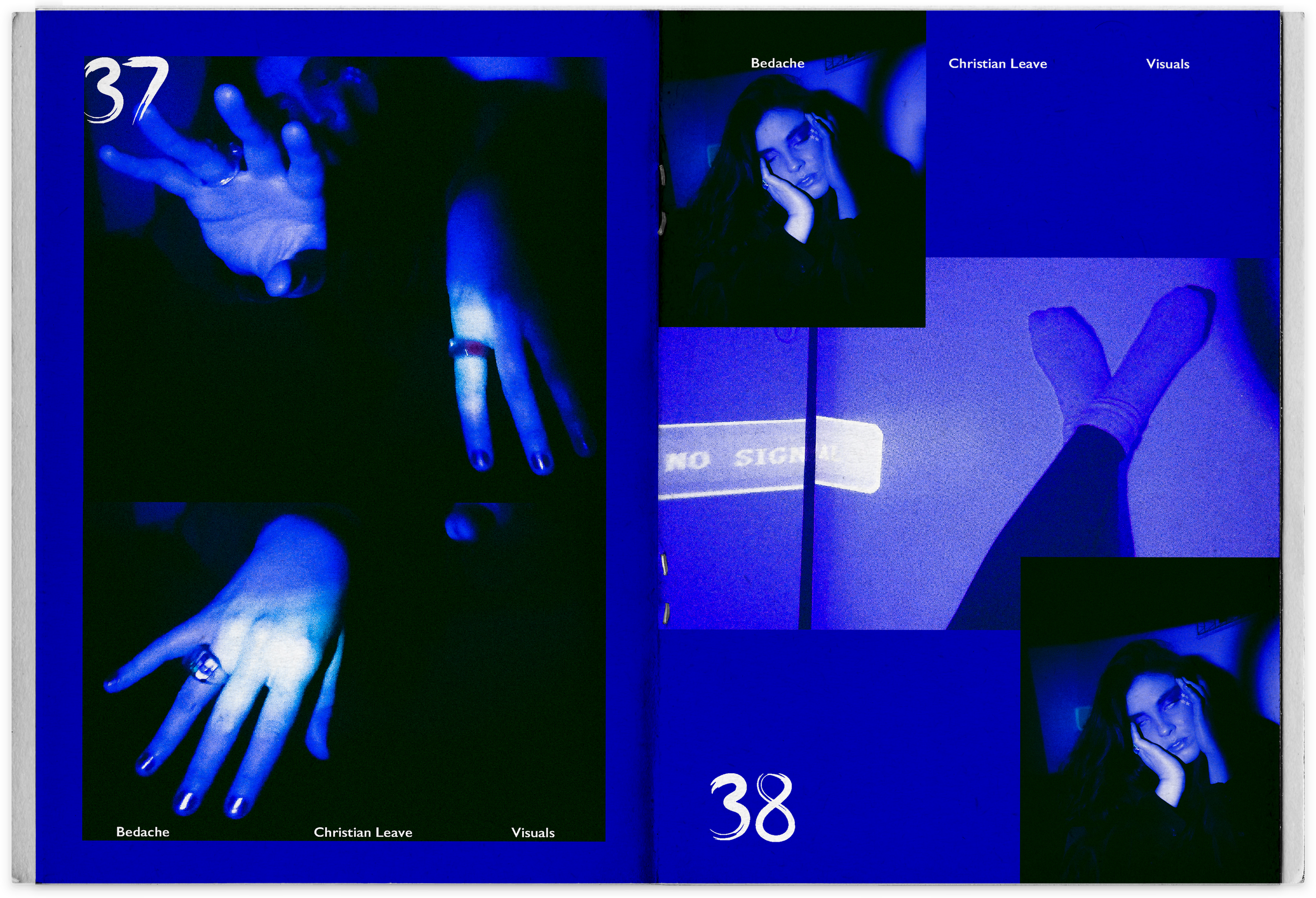
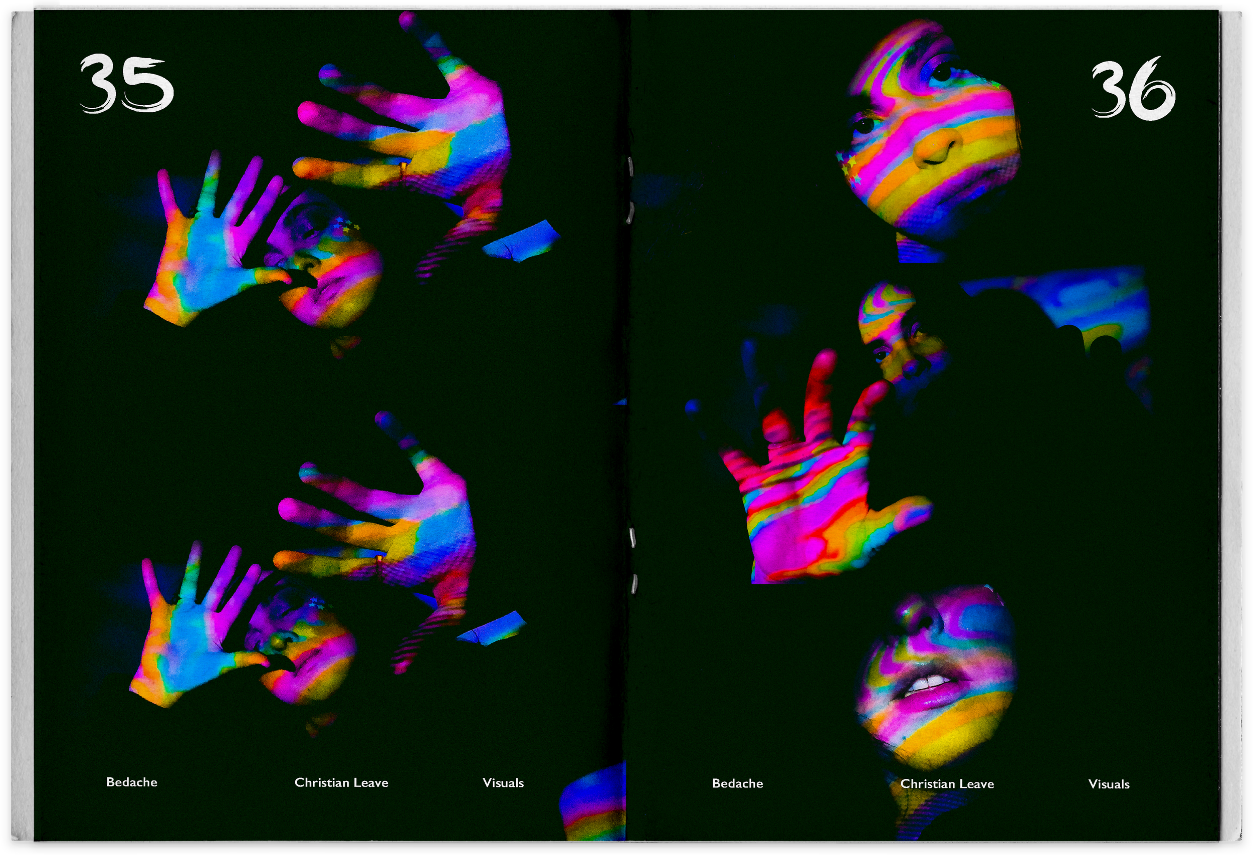
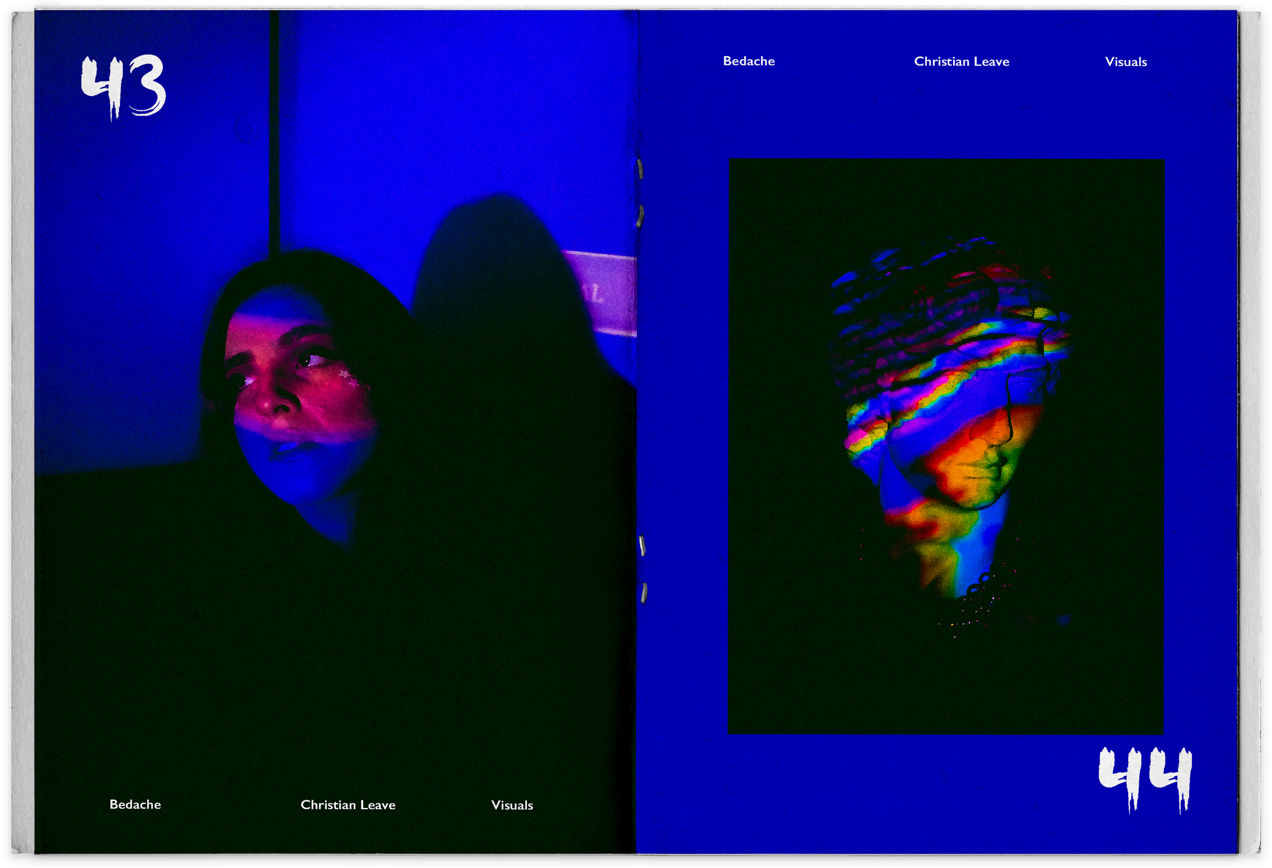
BEDACHE
C h r i s t i a n L e a v e

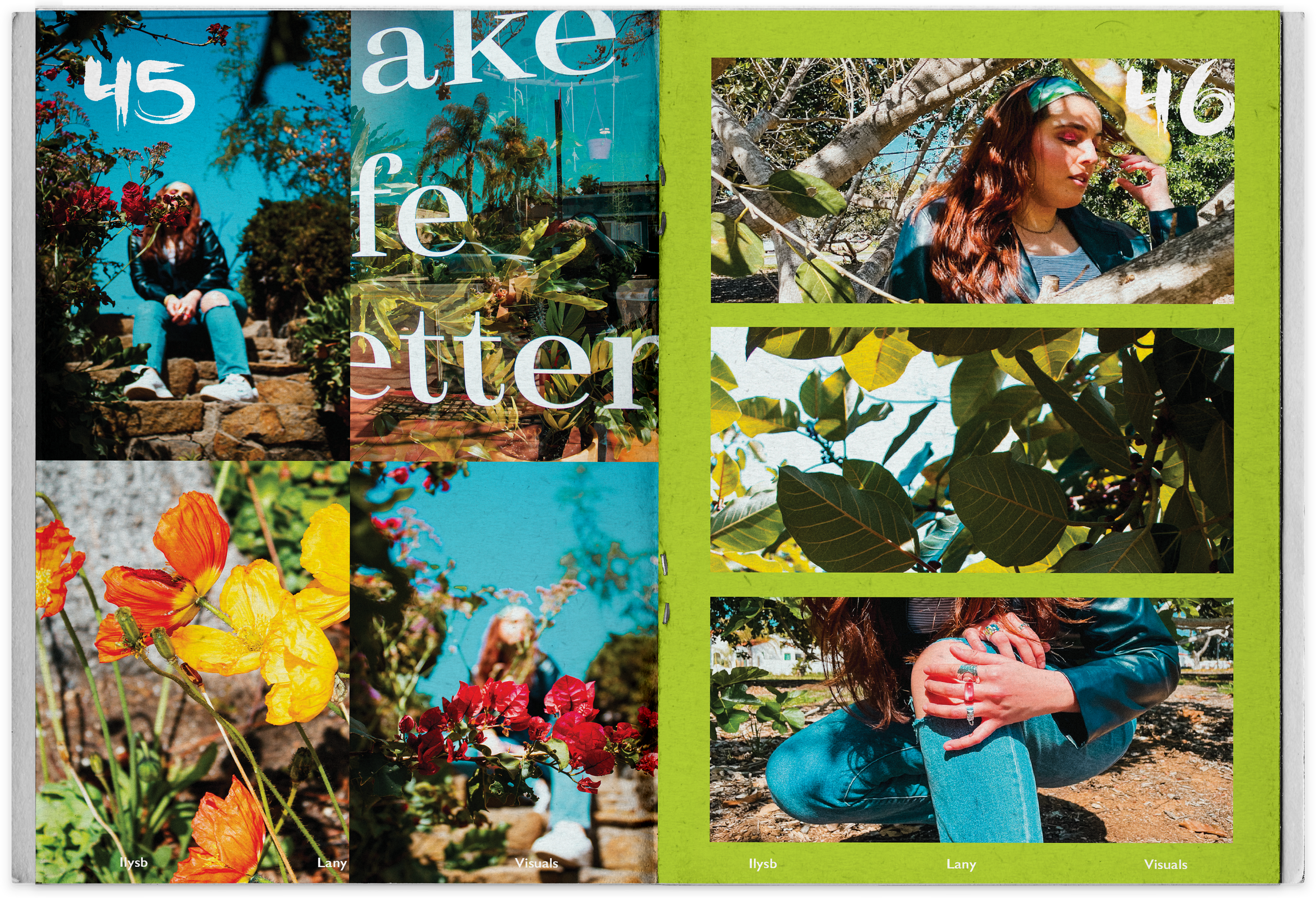
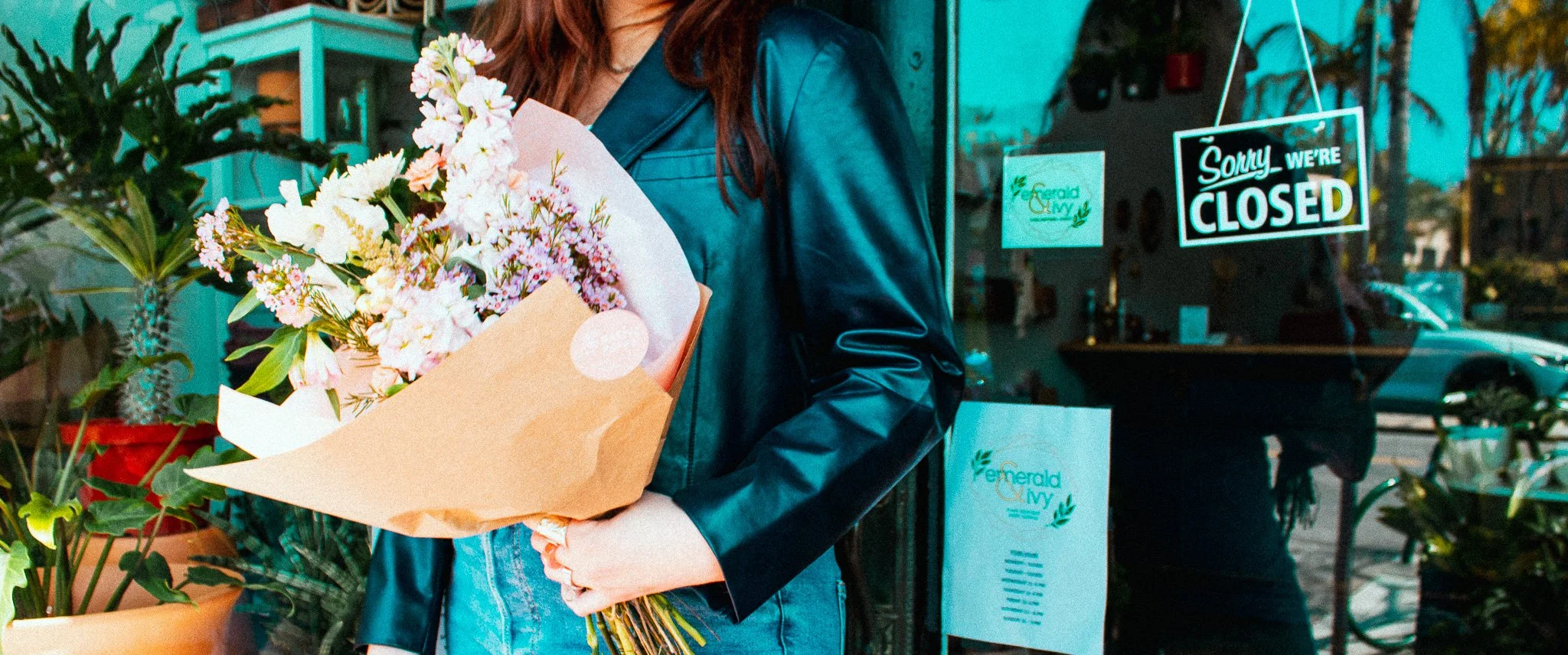
ILYSB
L a n y