
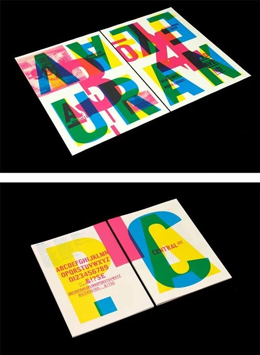
The showcasing of the typeface Gill Sans created by Eric Gill.
Typographer Font Book
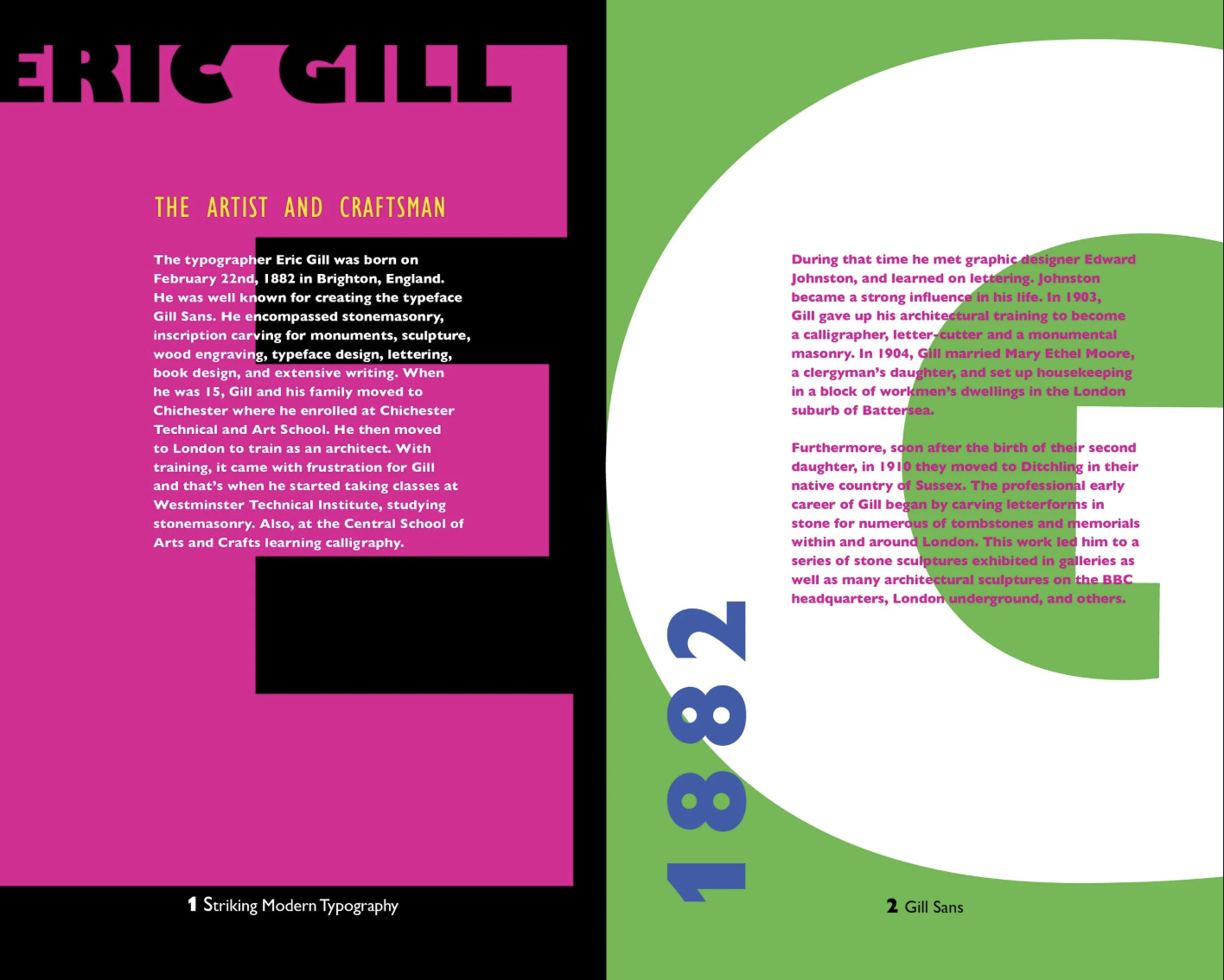
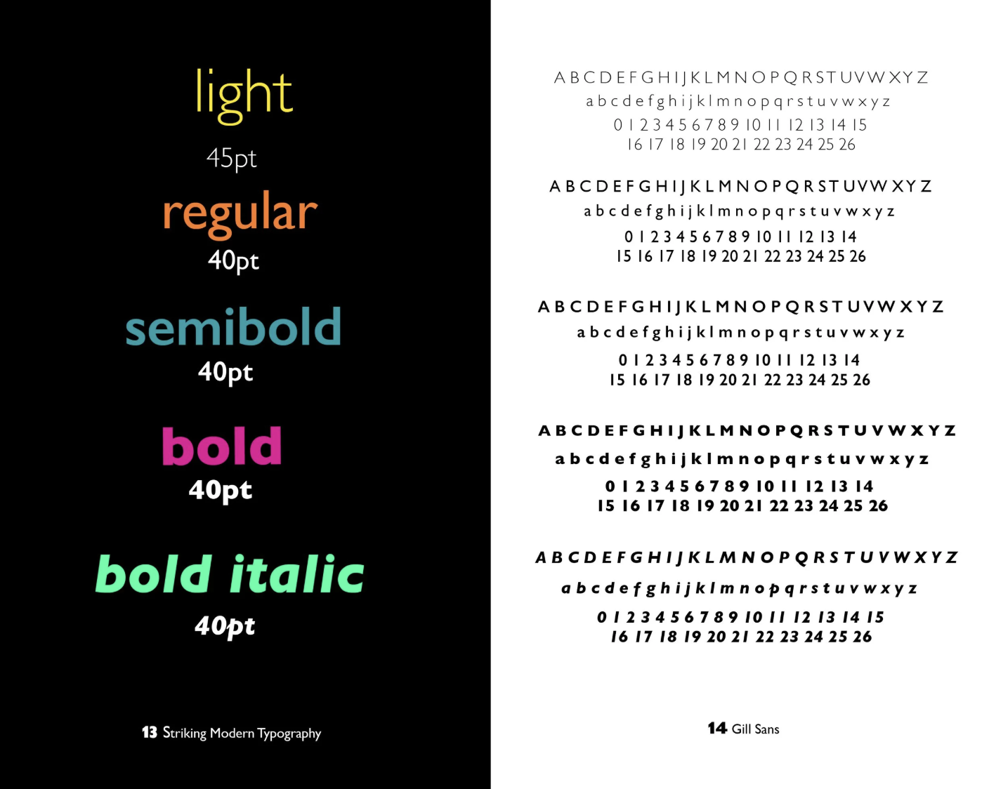
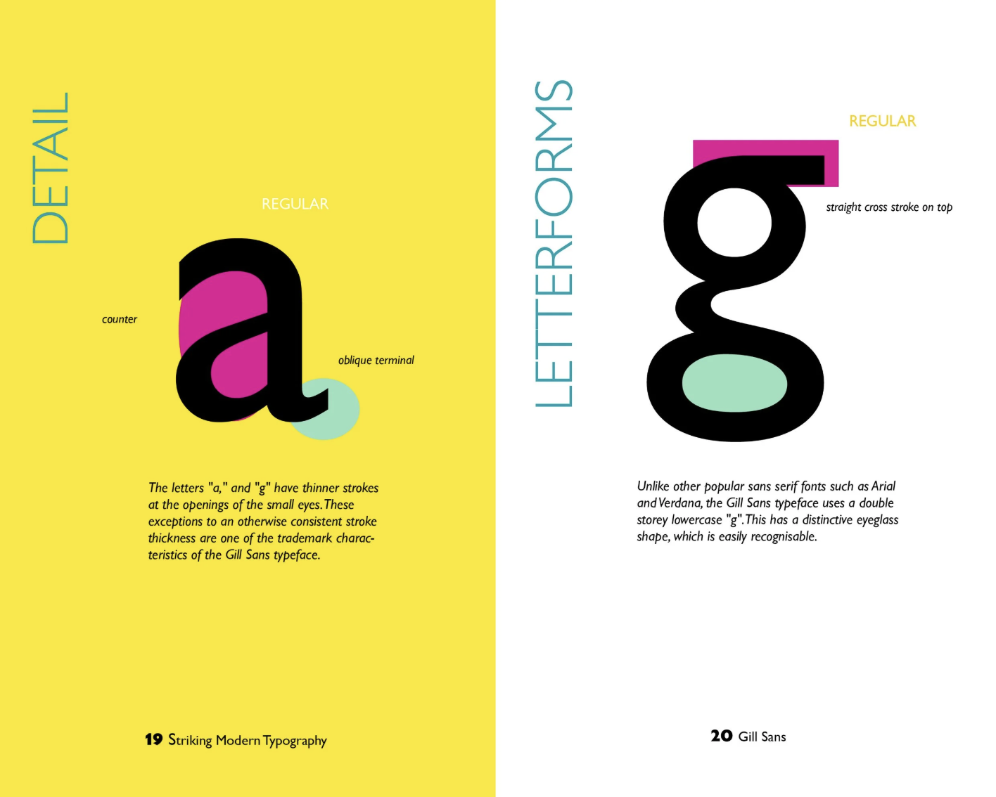
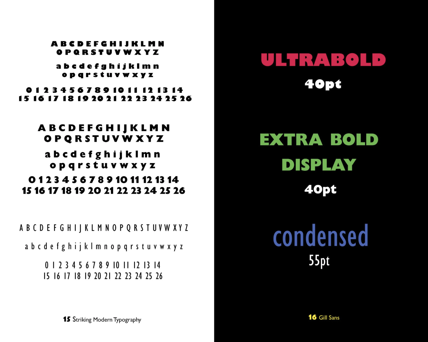
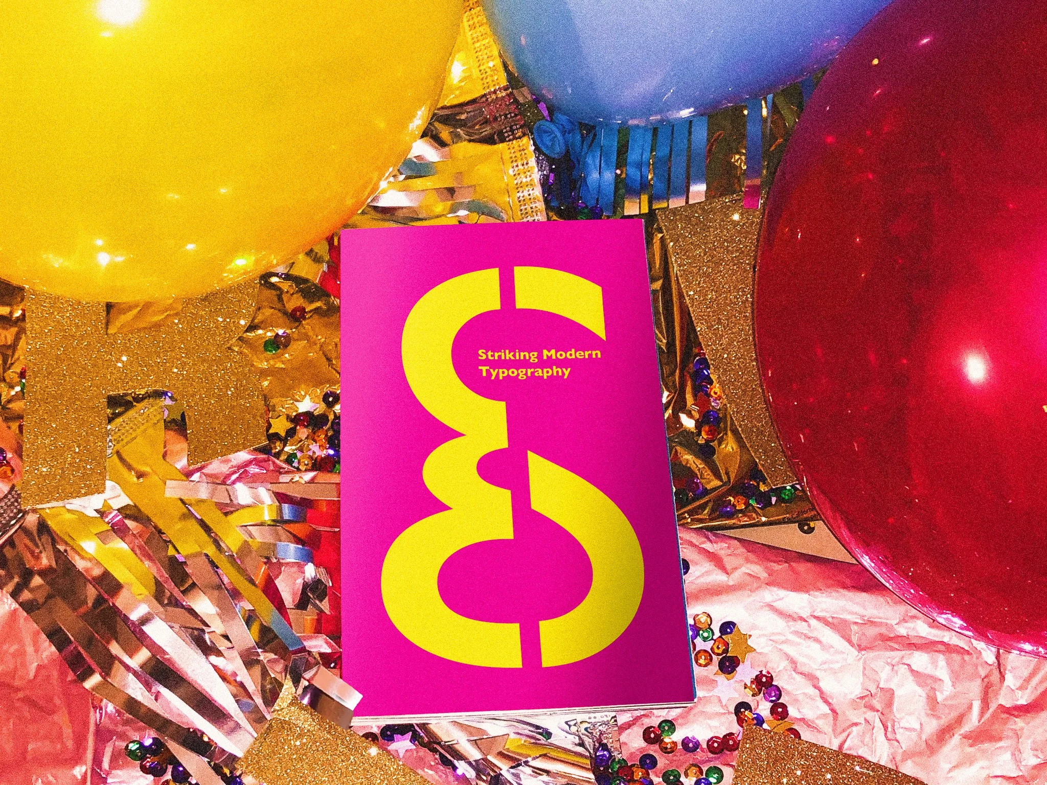
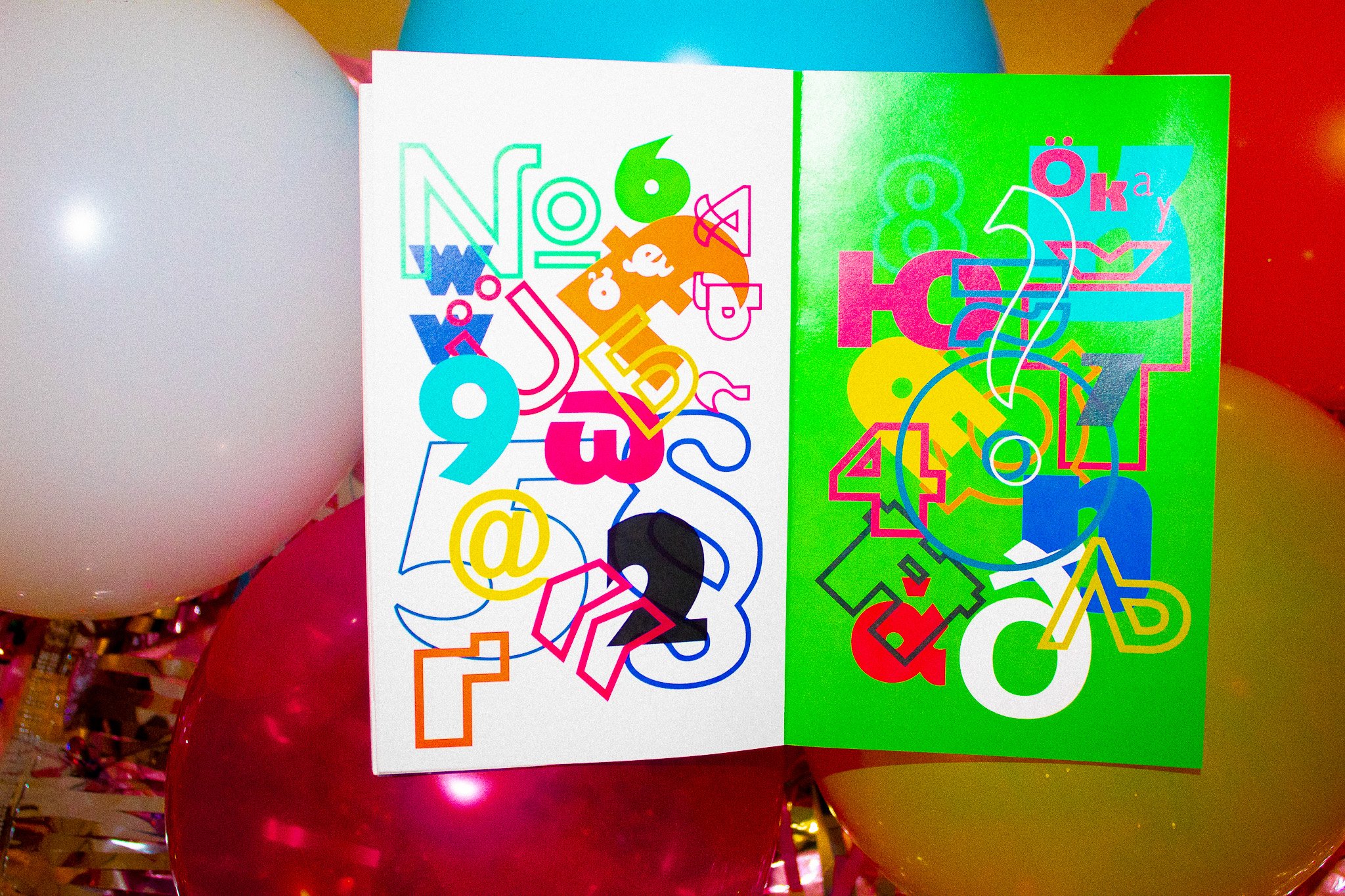
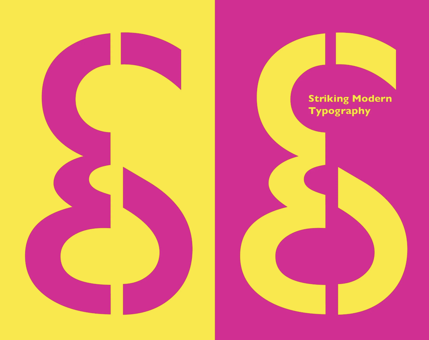
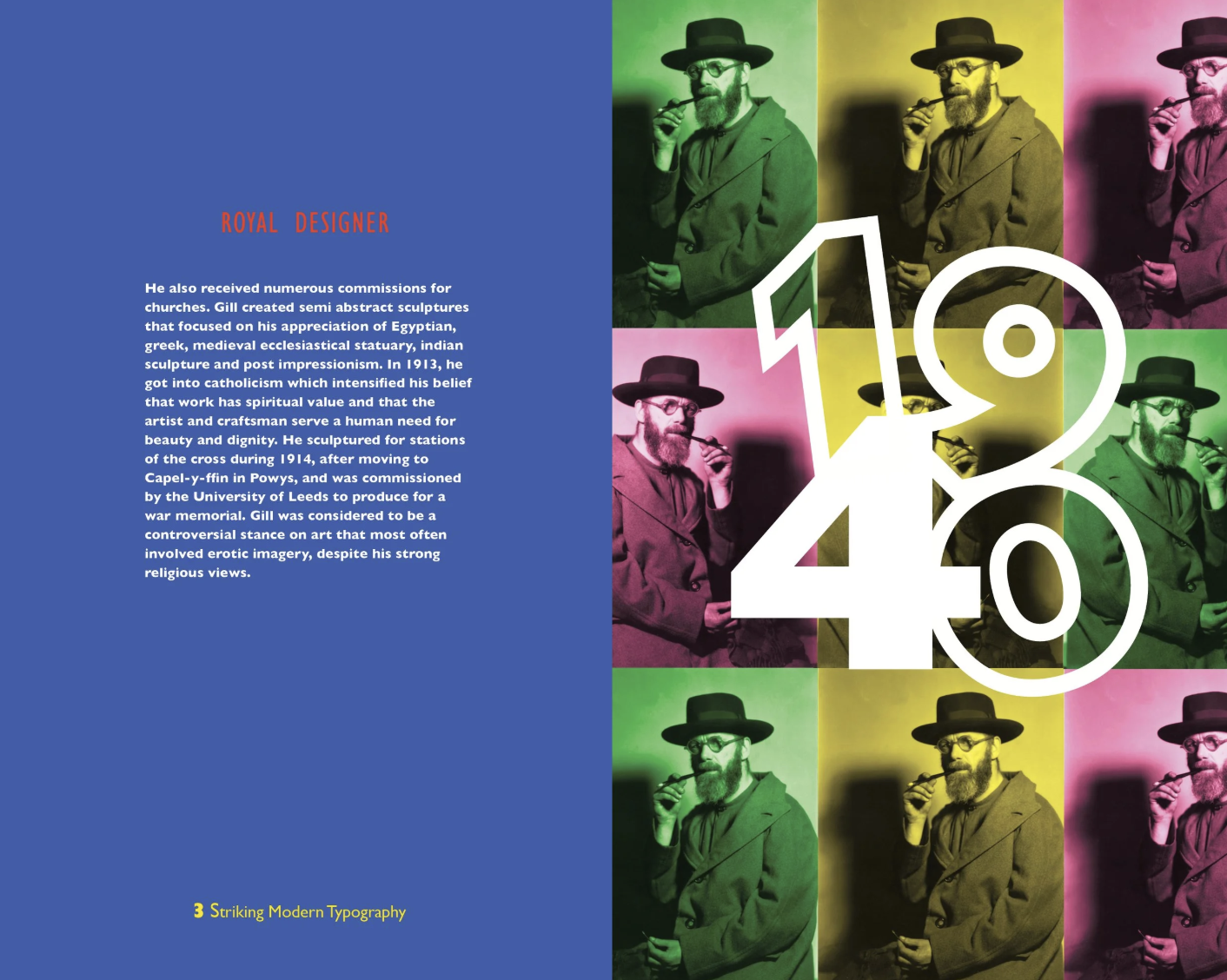
This book focuses on the typographer Eric Gill and his typeface Gill Sans created in 1928. It consists of a color system of eight colors, which integrates to the playfulness experience of the layouts. The idea of the project was studying the typeface’s history and form. As it already has fun features within the lettering, when studying the typeface, i found about how it was used in the modern world, which something sparked in that moment.
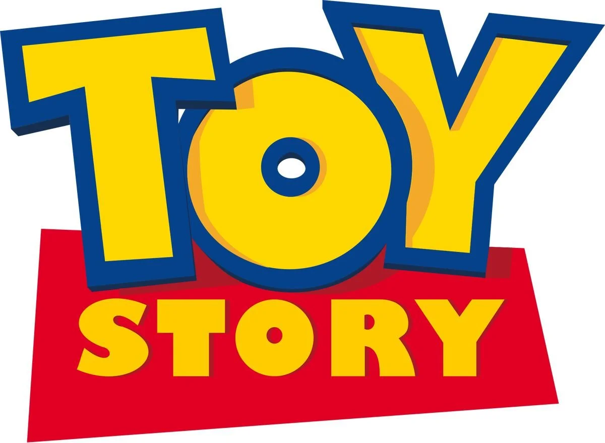
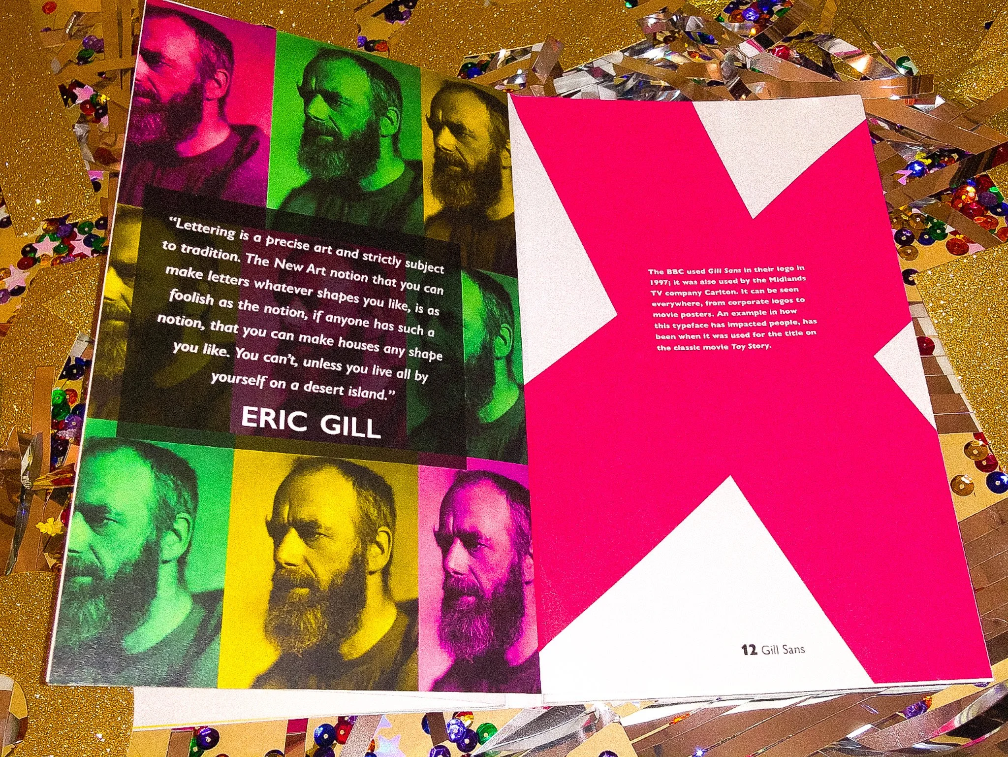
The typeface on it’s own was already seen as a modern typeface and i wanted to keep it in that sense. I found that the typeface, was used for logos to signage, signage in transportation and book covers. More in the present time i found out, that the type was used for the title of my favorite childhood movies, Toy Story. Which is what i brought into the scene, the idea of inner child in the colors, to the composition of the type in the layouts and the tone.
The task was discovering and understanding the uniqueness of Eric Gill’s typeface. Learn the best qualities of the type’s form and what could be the best way to display the font.
Editorial Design
FALL 2019

moodboard

color, typography and process


“Look after goodness
and truth, beauty will
look after herself.”
— Eric Gill
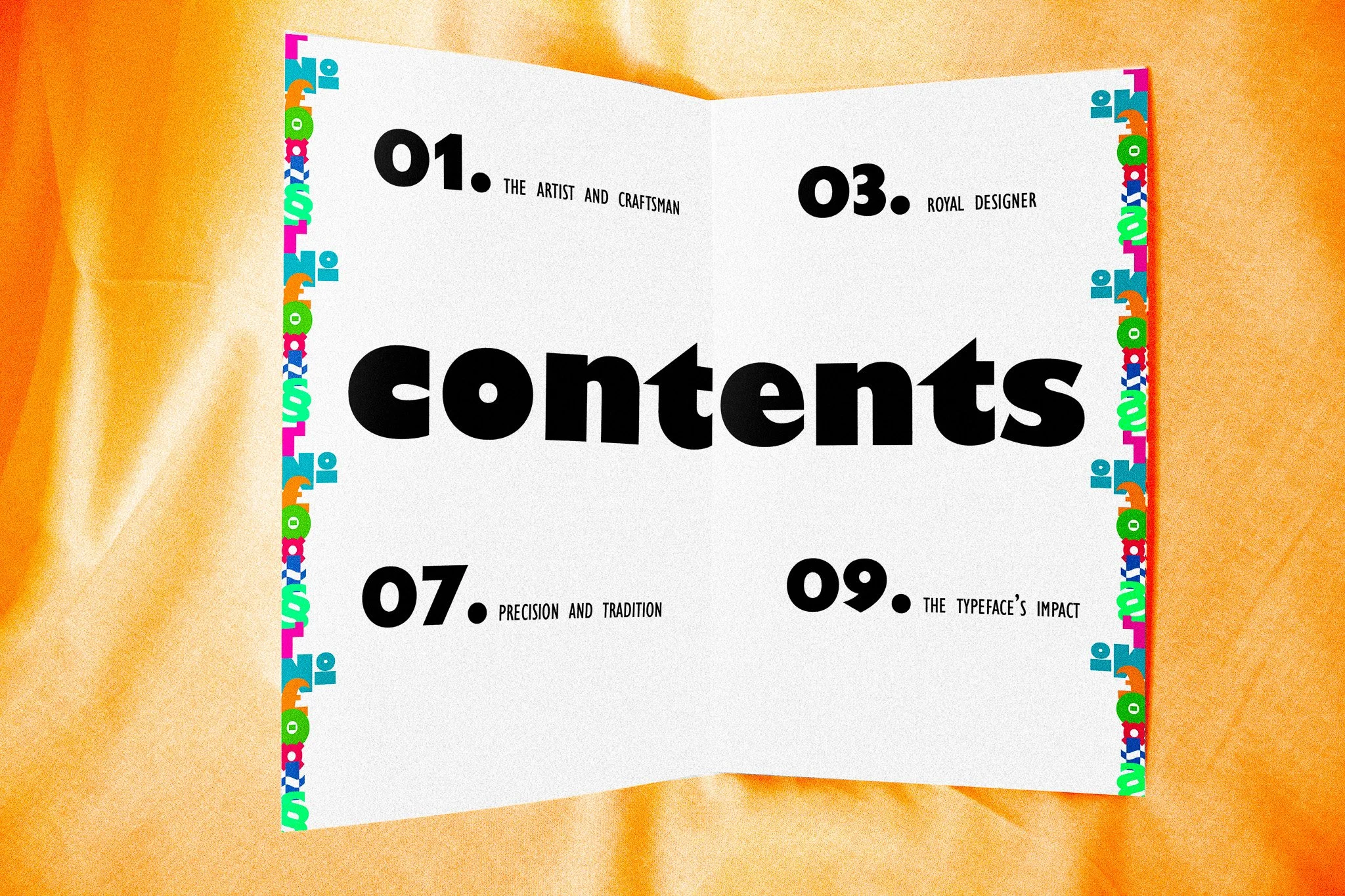


Book Layouts